Announcement

Collapse
No announcement yet.
X
  • Filter
  • Time
  • Show
Clear All
new posts

  • Proportional Area Chart?

    Hi folks,

    I know these are typically not recommended because they make comparing across categories difficult, but does anyone know if there's a way to produce proportional area charts, similar to the one below, in Stata?


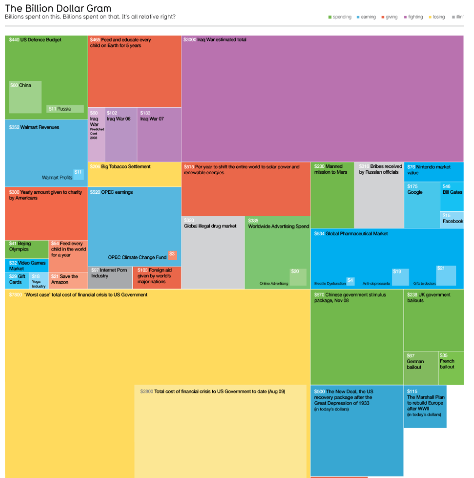
    Example data is pretty trivial, but here's some categorical data that could be visualized using a proportional area chart.

    Code:
    * Example generated by -dataex-. To install: ssc install dataex
    clear
    input str1 category
    "A"
    "A"
    "A"
    "A"
    "A"
    "A"
    "A"
    "A"
    "A"
    "A"
    "B"
    "B"
    "B"
    "B"
    "B"
    "C"
    "C"
    "C"
    "C"
    "C"
    "C"
    "C"
    "C"
    "C"
    "C"
    "C"
    "C"
    "C"
    "C"
    "C"
    "D"
    "D"
    "D"
    "D"
    "D"
    "D"
    "D"
    "D"
    "D"
    "D"
    "D"
    "D"
    "D"
    "D"
    "D"
    "D"
    "D"
    "D"
    "D"
    "D"
    end

  • #2
    For four categories of a single variable, a stacked bar chart from graph bar or graph hbar provides such a chart.

    Comment


    • #3
      Whoops, missed this response, thanks Nick. I'm looking for something that works with more than 4 categories.

      Comment


      • #4
        For five .. six ... any number of categories of a single variable, the same is true. Four was a reference to your example data.

        I don't get why this graph is better than a table or use of a plainer one-dimensional dot or bar chart. Here there is no obvious logic to what is put where or to the shape of each element. This is information graphics which is really not so good in my view at conveying information. Perhaps the colouring is indicative, but items that are similar can be grouped together and/or coloured or symbolised differently in those displays too.

        Why not show your real data? What we need are the just the collapsed or contracted frequencies or percents.

        (No one has contradicted my implicit reply, which was that I know of no canned Stata code for this kind of display.) Apart from the (ambiguous?) inclusions, it's a map, but you'd need to code up all the coordinates of the vertices, which is the bigger deal, naturally.)


        Comment


        • #5
          Thanks again Nick. I agree there's lots of other options for displaying this sort of data.

          Comment

          Working...
          X