Announcement

Collapse
No announcement yet.
X
  • Filter
  • Time
  • Show
Clear All
new posts

  • Heatmap in a 20 by 20 table

    Dear listers

    I would really like to make a heat map of some events over time.
    But i cannot seem to wrap my head around how to do it.

    an example data could look like this:

    Code:
    input group age_gr event1 event2 event3 event4 event5
    1 1 10 20 30 20 20
    0 1 5 5 5 5 80
    1 2 40 10 30 5 15
    0 2 25 25 25 25 0
    1 3 25 15 30 20 10
    0 3 10 20 30 30 10
    end
    when i write

    Code:
    preserve
    keep if group==1
    graph bar event*, over(age_gr) stack
    restore
    the example data looks fine, but i have 17 event codes and 20 age_gr, and frankly it turns out a bit messy.

    I thought of heat mapping using hmap, but the data format in the example in the help files are different from mine.

    what i would like is something that looks like this:


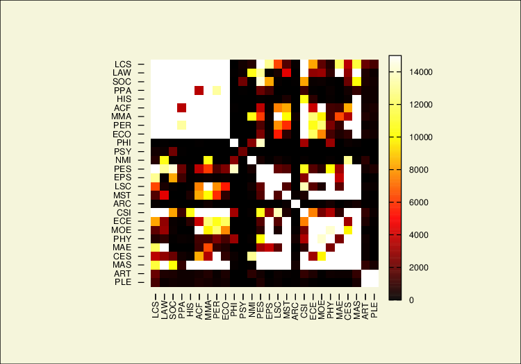
    but with the scale going from 0 to 100% (keeping in mind that the data in my set is % with 4 decimal points) and the x-axis being the age_groups

    Is this doable?

    Thank you.

    Lars

  • #2
    LarsFolkestad It can be a bit challenging since it will require a decent amount of restructuring of the data, but I'd put something together to construct heatmaps of correlation tables that you may find helpful in a program I started working on a little while ago eda. You'd want to look at the subroutine edaheat.ado, but it shouldn't be too difficult depending on what exactly you are doing to get the data into a comparable structure.

    Comment


    • #3
      Thank you wbuchanan but how do i download the ado files?
      lars

      Comment


      • #4
        Code:
        search heat map
        indicates yet other user-written ways to do it. I can't advise on which is good/better/best.

        P.S. I am lukewarm about heat maps. Do people really learn from anybody else's heatmap?
        Last edited by Nick Cox; 01 Feb 2016, 14:49.

        Comment


        • #5
          Dear Nick

          I appreciate your advice and i am always interested in presenting my data the best way possible.

          What i want is to show the that the 'pattern-of-events' changes over time.

          a totally fictional example would be to look at the color of t-shirts bought by women ( my data sample would be my daughter aged 3, my wife that i've known for the last 15 years and my mum)

          My 3 year old only wants two colors: Pink and purple, but has some grey and white t-shirts in there
          My wife buys black, gray and green tees
          my mum buys mainly orange ones

          My idea would be to create a heat map of the percent of the total amount of t-shirts bought pr color and age group, here the closer to 100% the 'warmer' the heat map gets.

          If you have better ideas of showing this i am all ears.

          Lars

          Comment


          • #6
            You've picked an example in which the colours are the data, so showing them directly is exactly what is needed.

            That's a minority case for heat maps.

            I suspect that *omics people in biology get used to them.

            Comment


            • #7
              i know the *omics people are using heat maps a lot. But maybe its not the right way to go for me.
              if i chose a different example, of lets say events, as in my example at the top. What would you do than.
              Same premis - the data is the distribution of events pr age group.

              the goal being to try to descriptively show the different events patterns over time.

              Comment


              • #8
                Show us real(istic) data and you may well get specific suggestions.

                Comment


                • #9
                  The data presented in my first post in this thread should be representative. the given values in event 1-5 are percent of total amount of events pr age group.

                  Comment


                  • #10
                    5 events and 6 instances won't be a hard test of any graphical idea.

                    Comment


                    • #11
                      Lars Folkestad I've not packaged the program up, but you could copy the source from the link provided above. Nick Cox in my case, I created the program to graphically represent a correlation matrix. With a diverging color palette, it seems to be a fairly easy way to communicate the strength/weakness and direction of a relationship between variables to folks that might get intimidated by looking at numbers (which happens too often in the US Educational system). So rather than trying to explain a correlation coefficient, I could instead say something about as the cell becomes more (insert color here) it means there is a stronger (insert direction here) relationship between these two variables. The more difficult challenge about scaling it effectively seems to be labeling it in a way that makes it easy for others to read/identify the variables. I've also seen heatmaps used effectively when the purpose is to illustrate patterns that get collapsed into some continuum and/or category (e.g., factor analyses, latent class/profile analysis, etc...). However, I agree that the use cases for it are fairly limited.

                      Comment


                      • #12
                        I wrote a corrtable which is on SSC. I am sure it's trying something different from your program. This is the second example from the help file.

                        Click image for larger version

Name:	corrtable.png
Views:	1
Size:	49.1 KB
ID:	1325261

                        Comment


                        • #13
                          Nick Cox that would work as well. Some of it was due to being part of a larger project, but this could easily work as well. I ended up using the contour plot command to do things, but it may become obsolete if I put enough time into the d3 fork I've been working on.

                          Comment


                          • #14
                            Nick Cox and just for clarification, what I mean is that I may not need the program I developed if I can build out easier to use interfaces that use the D3 js library.

                            Comment


                            • #15
                              LarsFolkestad
                              Just realized I never really circled back around. There is now a package available that you can install using:

                              Code:
                              net inst eda, from(https://wbuchanan.github.io/eda) replace
                              It has dependencies on brewscheme, tuples, spineplot, and estout and will install them if not already installed. If you have an older version of brewscheme installed it will definitely create an error, but if you uninstall brewscheme eda will prompt you to install it when you go to run it for the first time. There are also some slides from the Stata Conference talk here as well.

                              Comment

                              Working...
                              X