Hello statalisters
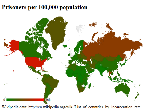
I am creating several maps showing prison rates using Maurizio Pisati's user written command smpap in Stata 13 SE. I seem to have problems with the colors. I use fcolor(Blues) and custom color breaks to show intensity. The command draws the map but countries like the US or Russia, for example, do not appear with the highest intensity of the Blues color palette. I have tried different custom breaks without much luck. I run out of ideas to fix this.
Any help will be greatly appreciated. Below I enclose the code for the map and a picture of the resulting map
#delimit;
spmap prison using worldcoor.dta, id(id) fcolor(Blues)
clmethod(custom) clbreaks(0 100 300 600 800)
legend(symy(*2) symx(*2) size(*2) position (9))
legorder(hilo) legend(label(2 "0 to 100") label(3 "100 to 300" )label(4 "300 to 600" )
label(5 "600 to 800" ) size(vsmall))
;
# delimit cr
Comment