Announcement

Collapse
No announcement yet.
X
  • Filter
  • Time
  • Show
Clear All
new posts

  • Bar graph for categorical variables

    Hi,

    I am struggling with how to plot a bar graph with x-axis have three categories, for each category it represents the coding for variable g1a_1 (1 No, 2 Neutral, 3 Yes) by group (0 control, 1 intervention), so it will be a total of 6 vertical bars and each of the adjacent two bars represent the "no", "neutral", "yes" responses for control and intervention respectively. Also, on the x-axis, the bar for control and intervention slightly overlaps with each other (bargap(-30)). Y-axis shows the percentage. On top of each bar there is the count for the g1a_1 = 1, g1a_1 = 2, g1a_1 = 3 in control and intervention group separately.

    I checked Stata manual, didn't find the information for my case. I also found a user-write command -fbar-, but it doesn't allow -bargap()- option.
    Code:
    * Example generated by -dataex-. To install: ssc install dataex
    clear
    input float(g1a_1 g1b_1 g1c_1 g1d_1 g1e_1 group)
    3 3 3 3 1 1
    1 1 1 1 1 1
    1 1 1 1 1 0
    1 3 3 2 3 1
    1 1 1 1 1 1
    1 1 1 1 1 1
    1 1 1 1 1 1
    1 1 1 1 1 1
    1 1 1 1 1 0
    1 1 1 1 1 1
    1 1 1 1 1 1
    1 1 1 1 1 0
    3 1 1 2 2 1
    1 1 1 1 1 1
    1 1 2 2 2 0
    1 1 1 1 3 1
    1 1 1 1 1 0
    1 1 1 1 1 0
    3 2 2 1 1 1
    1 2 3 1 1 1
    3 1 3 3 2 0
    3 3 3 3 3 1
    1 1 1 1 1 0
    1 1 1 1 1 0
    1 1 1 1 1 0
    1 1 1 1 1 1
    2 1 1 1 1 0
    1 2 3 1 2 0
    1 1 3 1 1 0
    1 1 1 1 1 1
    1 1 1 1 1 1
    3 3 3 3 3 1
    1 3 1 3 1 1
    1 1 1 1 1 1
    2 2 2 2 1 0
    1 1 1 1 1 1
    1 1 1 1 1 0
    1 1 1 2 2 1
    2 2 1 3 1 0
    1 1 1 1 1 1
    1 1 1 1 2 1
    1 1 1 1 1 0
    1 1 1 1 1 0
    1 1 1 1 1 0
    1 1 1 1 1 0
    1 1 1 1 1 0
    1 1 1 1 1 0
    1 1 1 1 1 1
    3 3 2 1 1 1
    1 1 1 1 1 1
    1 1 1 1 1 1
    1 1 1 1 1 1
    1 1 2 1 1 0
    1 3 3 1 1 0
    1 1 1 1 1 0
    1 1 1 1 1 1
    1 1 1 1 1 0
    1 1 1 1 1 1
    3 3 2 1 1 1
    1 1 1 1 1 1
    3 3 1 1 1 1
    3 3 3 1 1 1
    1 1 1 1 1 0
    1 1 1 1 1 1
    1 1 1 1 1 0
    1 1 1 1 1 1
    1 1 1 1 1 1
    3 3 1 3 1 1
    3 3 2 1 1 1
    1 1 2 1 1 0
    1 1 1 1 1 0
    2 1 3 2 1 1
    1 1 1 1 1 0
    1 1 1 1 1 1
    1 1 1 1 1 1
    1 1 1 1 1 0
    1 1 1 1 1 1
    3 1 1 1 1 1
    1 1 1 2 2 1
    3 3 2 3 2 1
    1 1 1 1 1 0
    1 1 2 1 1 0
    1 1 1 1 1 0
    1 1 1 1 1 0
    1 1 1 2 2 0
    1 1 3 1 1 0
    1 1 1 1 1 1
    1 1 1 3 2 1
    1 1 1 1 1 1
    1 1 1 1 1 0
    1 1 1 1 1 0
    1 1 1 1 1 0
    1 1 1 1 1 0
    3 3 3 1 1 1
    1 1 2 3 1 0
    1 1 1 1 1 1
    1 1 1 1 1 0
    1 1 1 1 1 0
    1 1 1 1 1 1
    1 1 1 1 1 1
    end
    label values g1a_1 common_label
    label values g1b_1 common_label
    label values g1c_1 common_label
    label values g1d_1 common_label
    label values g1e_1 common_label
    label values group group
    label def group 0 "Control", modify
    label def group 1 "Intervention", modify
    Thanks in advance for your thoughts and sharing the code.

    Regards,
    Mengmeng

  • #2
    You seem to be referring to graph code -- and a graph -- you do not show us. Starting with your input code, I add

    Code:
    label def common_label 1 No 2 Neutral 3 Yes 
    
    graph bar (count)  , over(g1a_1) over(group) blabel(bar) yla(, ang(h)) ysc(r(0 43))
    and get this.

    Click image for larger version

Name:	mengmeng.png
Views:	2
Size:	20.8 KB
ID:	1376910


    How does it differ from what you want?


    Attached Files

    Comment


    • #3
      Hi Nick,

      Thank you for your prompt reply.

      Is there any possible ways to put control and intervention group together? For example, within the "No" category there will be two bars, one indicating control, the other one indicating intervention, and colored differently. The two vars are overlapping a bit with each other (bargap(-30)). The same thoughts apply to the rest two categories, "neutral" and "yes".

      Regards,
      Mengmeng

      Comment


      • #4
        You didn't experiment very much!

        Code:
        graph bar (count), over(group) over(g1a_1) blabel(bar) yla(, ang(h)) ysc(r(0 43))
        I don't understand your reference to bargap(-30). There is no such setting in my example and the bars do not overlap.

        Once again, there is little point in our trying to discuss code which you do not show us.

        Comment


        • #5
          Hi Nick,

          In Stata manual, there is an option (bargap())for bar graph. It helps modify the distance between two bars. From what I read, if specify -30 for bargap, the two bars will overlap each other by 30% of the width of the bar.

          After your last reply, I did a lot of search and found a command -slideplot- to graph data recorded on a Likert Scale. I applied the command to my case:

          slideplot hbar g1a_1, by(group) neg(1 2) pos(3) bar(1, bcolor(blue*0.4)) bar(2, bcolor(blue*0.8)) bar(3, bcolor(red*0.2)) legend(row(1) size(vsmall) lab(1 "Disagree/Strongly disagree") lab(2 "Neither disagree nor agree") lab(3 "Agree/Strongly agree")) title("Most Husbands hit their wives", size(msmall)) percent
          graph save graph1.gph, replace

          slideplot hbar g1b_1, by(group) neg(1 2) pos(3) bar(1, bcolor(blue*0.4)) bar(2, bcolor(blue*0.8)) bar(3, bcolor(red*0.2)) legend(row(1) size(vsmall) lab(1 "Disagree/Strongly disagree") lab(2 "Neither disagree nor agree") lab(3 "Agree/Strongly agree")) title("Most Parents hit their children", size(msmall)) percent
          graph save graph2.gph, replace

          slideplot hbar g1c_1, by(group) neg(1 2) pos(3) bar(1, bcolor(blue*0.4)) bar(2, bcolor(blue*0.8)) bar(3, bcolor(red*0.2)) legend(row(1) size(vsmall) lab(1 "Disagree/Strongly disagree") lab(2 "Neither disagree nor agree") lab(3 "Agree/Strongly agree")) title("Most Teachers hit their students", size(msmall)) percent
          graph save graph3.gph, replace

          slideplot hbar g1d_1, by(group) neg(1 2) pos(3) bar(1, bcolor(blue*0.4)) bar(2, bcolor(blue*0.8)) bar(3, bcolor(red*0.2)) legend(row(1) size(vsmall) lab(1 "Disagree/Strongly disagree") lab(2 "Neither disagree nor agree") lab(3 "Agree/Strongly agree")) title("Most Boys hit their friends", size(msmall)) percent
          graph save graph4.gph, replace

          slideplot hbar g1e_1, by(group) neg(1 2) pos(3) bar(1, bcolor(blue*0.4)) bar(2, bcolor(blue*0.8)) bar(3, bcolor(red*0.2)) legend(row(1) size(vsmall) lab(1 "Disagree/Strongly disagree") lab(2 "Neither disagree nor agree") lab(3 "Agree/Strongly agree")) title("Most Girls hit their friends", size(msmall)) percent
          graph save graph5.gph, replace

          graph combine graph1.gph graph2.gph graph3.gph graph4.gph graph5.gph, row(3)

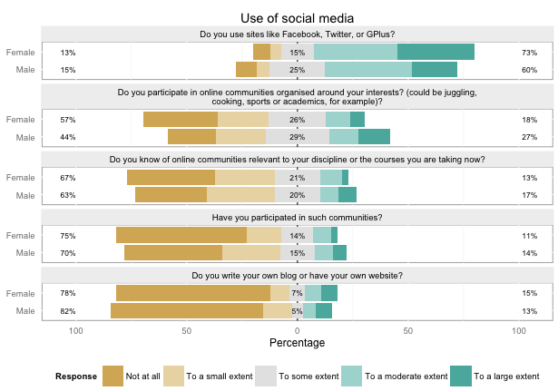
          It gives 5 individual plots. I am wondering if it is possible to combine each 5 variables (g1a_1, g1b_1, g1c_1, g1d_1, g1e_1) into one graph like this: (female and male being replaced by control and intervention group)


          Thanks a lot!

          Regards,
          Mengmeng

          Comment


          • #6
            Seems the picture was not successfully displayed. I am trying another time:


            Thanks a lot!

            Regards,
            Mengmeng

            Comment


            • #7
              Please use CODE delimiters to share command.

              Unfortunately, the graph is not visible, at least in my computer.

              With regards to plots, I kindly recommend to read the FAQ. In short, you may save the graph as .png extension. Then, please clikc on the "Upload Attachments" button in the upper side, in the left of the "A" sign. Then, you may upload the graph.
              Last edited by Marcos Almeida; 05 Mar 2017, 14:01. Reason: Edited: now the graph is visible!
              Best regards,

              Marcos

              Comment


              • #8
                Originally posted by Marcos Almeida View Post
                Please use CODE delimiters to share command.

                Unfortunately, the graph is not visible, at least in my computer.

                With regards to plots, I kindly recommend to read the FAQ. In short, you may save the graph as .png extension. Then, please clikc on the "Upload Attachments" button in the upper side, in the left of the "A" sign. Then, you may upload the graph.
                Hi Marcos,

                Thanks for your reply.

                The following is my code. I didn't find "#" in the toolbar to allow insert the CODE delimiters and still no sign showed up after I clicked on underlined A button. So I manually added the CODE delimiter make-ups. Hopefully it works.

                Code:
                slideplot hbar g1a_1, by(group) neg(1 2) pos(3) bar(1, bcolor(blue*0.4)) bar(2, bcolor(blue*0.8)) bar(3, bcolor(red*0.2)) legend(row(1) size(vsmall) lab(1 "Disagree/Strongly disagree") lab(2 "Neither disagree nor agree") lab(3 "Agree/Strongly agree")) title("Most Husbands hit their wives", size(msmall)) percent
                graph save graph1.gph, replace
                slideplot hbar g1b_1, by(group) neg(1 2) pos(3) bar(1, bcolor(blue*0.4)) bar(2, bcolor(blue*0.8)) bar(3, bcolor(red*0.2)) legend(row(1) size(vsmall) lab(1 "Disagree/Strongly disagree") lab(2 "Neither disagree nor agree") lab(3 "Agree/Strongly agree")) title("Most Parents hit their children", size(msmall)) percent
                graph save graph2.gph, replace
                slideplot hbar g1c_1, by(group) neg(1 2) pos(3) bar(1, bcolor(blue*0.4)) bar(2, bcolor(blue*0.8)) bar(3, bcolor(red*0.2)) legend(row(1) size(vsmall) lab(1 "Disagree/Strongly disagree") lab(2 "Neither disagree nor agree") lab(3 "Agree/Strongly agree")) title("Most Teachers hit their students", size(msmall)) percent
                graph save graph3.gph, replace
                slideplot hbar g1d_1, by(group) neg(1 2) pos(3) bar(1, bcolor(blue*0.4)) bar(2, bcolor(blue*0.8)) bar(3, bcolor(red*0.2)) legend(row(1) size(vsmall) lab(1 "Disagree/Strongly disagree") lab(2 "Neither disagree nor agree") lab(3 "Agree/Strongly agree")) title("Most Boys hit their friends", size(msmall)) percent
                graph save graph4.gph, replace
                slideplot hbar g1e_1, by(group) neg(1 2) pos(3) bar(1, bcolor(blue*0.4)) bar(2, bcolor(blue*0.8)) bar(3, bcolor(red*0.2)) legend(row(1) size(vsmall) lab(1 "Disagree/Strongly disagree") lab(2 "Neither disagree nor agree") lab(3 "Agree/Strongly agree")) title("Most Girls hit their friends", size(msmall)) percent
                graph save graph5.gph, replace
                graph combine graph1.gph graph2.gph graph3.gph graph4.gph graph5.gph, row(3)
                The graph display I want was attached as .png as follows.

                Thank you very much.

                Regards,
                Mengmeng
                Attached Files

                Comment


                • #9
                  Hello Mengmeng,

                  There is a instruction in the FAQ, just in case you don't see the # sign:

                  Code:
                   12.3 How to use CODE delimiters
                  
                   [...]
                  When you are editing an answer you should see a # button in the toolbar above the text area. Click on # to insert CODE and CODE mark-up. Write your code between, paying particular attention to linebreaks and indentation.
                  
                  If you do not see that button, then click on the “Toggle Advanced Editor” button (an underlined A) in the area above to show the toolbar.
                  
                  If you do not have access to the Advanced Editor in your interface, you can just insert those mark-ups manually before, or indeed after, you insert your code. Many people fast at typing do that any way.
                  If you have clicked in the A and failed to see the # sign, it seems you do not have access to the Advanced Editor.

                  Being this so, well, your strategy to share command (and graph) was successful anyway!
                  Last edited by Marcos Almeida; 05 Mar 2017, 14:42.
                  Best regards,

                  Marcos

                  Comment


                  • #10
                    Originally posted by Marcos Almeida View Post
                    Hello Mengmeng,

                    There is a instruction in the FAQ, just in case you don't see the # sign:

                    Code:
                     12.3 How to use CODE delimiters
                    
                    [...]
                    When you are editing an answer you should see a # button in the toolbar above the text area. Click on # to insert CODE and CODE mark-up. Write your code between, paying particular attention to linebreaks and indentation.
                    
                    If you do not see that button, then click on the “Toggle Advanced Editor” button (an underlined A) in the area above to show the toolbar.
                    
                    If you do not have access to the Advanced Editor in your interface, you can just insert those mark-ups manually before, or indeed after, you insert your code. Many people fast at typing do that any way.
                    If you have clicked in the A and failed to see the # sign, it seems you do not have access to the Advanced Editor.

                    Being this so, well, your strategy to share command (and graph) was successful anyway!
                    Hi Marcos,
                    Yes, I went to FAQ section and followed the instructions. Thank you for letting me know everything is working well now. I apologize for previous inconvenience.

                    Best regards,
                    Mengmeng

                    Comment


                    • #11
                      Originally posted by Mengmeng Li View Post

                      Hi Marcos,

                      Thanks for your reply.

                      The following is my code. I didn't find "#" in the toolbar to allow insert the CODE delimiters and still no sign showed up after I clicked on underlined A button. So I manually added the CODE delimiter make-ups. Hopefully it works.

                      Code:
                      slideplot hbar g1a_1, by(group) neg(1 2) pos(3) bar(1, bcolor(blue*0.4)) bar(2, bcolor(blue*0.8)) bar(3, bcolor(red*0.2)) legend(row(1) size(vsmall) lab(1 "Disagree/Strongly disagree") lab(2 "Neither disagree nor agree") lab(3 "Agree/Strongly agree")) title("Most Husbands hit their wives", size(msmall)) percent
                      graph save graph1.gph, replace
                      slideplot hbar g1b_1, by(group) neg(1 2) pos(3) bar(1, bcolor(blue*0.4)) bar(2, bcolor(blue*0.8)) bar(3, bcolor(red*0.2)) legend(row(1) size(vsmall) lab(1 "Disagree/Strongly disagree") lab(2 "Neither disagree nor agree") lab(3 "Agree/Strongly agree")) title("Most Parents hit their children", size(msmall)) percent
                      graph save graph2.gph, replace
                      slideplot hbar g1c_1, by(group) neg(1 2) pos(3) bar(1, bcolor(blue*0.4)) bar(2, bcolor(blue*0.8)) bar(3, bcolor(red*0.2)) legend(row(1) size(vsmall) lab(1 "Disagree/Strongly disagree") lab(2 "Neither disagree nor agree") lab(3 "Agree/Strongly agree")) title("Most Teachers hit their students", size(msmall)) percent
                      graph save graph3.gph, replace
                      slideplot hbar g1d_1, by(group) neg(1 2) pos(3) bar(1, bcolor(blue*0.4)) bar(2, bcolor(blue*0.8)) bar(3, bcolor(red*0.2)) legend(row(1) size(vsmall) lab(1 "Disagree/Strongly disagree") lab(2 "Neither disagree nor agree") lab(3 "Agree/Strongly agree")) title("Most Boys hit their friends", size(msmall)) percent
                      graph save graph4.gph, replace
                      slideplot hbar g1e_1, by(group) neg(1 2) pos(3) bar(1, bcolor(blue*0.4)) bar(2, bcolor(blue*0.8)) bar(3, bcolor(red*0.2)) legend(row(1) size(vsmall) lab(1 "Disagree/Strongly disagree") lab(2 "Neither disagree nor agree") lab(3 "Agree/Strongly agree")) title("Most Girls hit their friends", size(msmall)) percent
                      graph save graph5.gph, replace
                      graph combine graph1.gph graph2.gph graph3.gph graph4.gph graph5.gph, row(3)
                      The graph display I want was attached as .png as follows.

                      Thank you very much.

                      Regards,
                      Mengmeng
                      Hi, I find this graph extremely appealing. I am struggling including the middle point , the one in gray in your graph. I hope you could help me.

                      Many thanks

                      Anna

                      Comment


                      • #12
                        Can I use "slide plot" to draw Likert Scale graph with Mean Score like below?
                        Thanks for my request.

                        Click image for larger version

Name:	Likert Scale with Mean Score.PNG
Views:	2
Size:	72.5 KB
ID:	1599508

                        Comment


                        • #13
                          See https://www.statalist.org/forums/for...ith-mean-score for an answer to #12, even if the question in that thread was not identical.

                          Win Khaing Please post in one thread at a time on any given topic.

                          Comment

                          Working...
                          X