Hello,
I have two variables (var1, var2) with three identical categories (suppose, oppose, neither).
I would like to create a bar graph showing the frequencies of each category for both of the variables.
The x-axis should show the three categories.
Two bars should be shown in each segment of the x-axis (representing the categories) reporting the frequency of individuals in this category for each of the two variables, resulting in 6 bars.
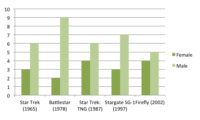
It should look something like this (but this dataset has a different data structure):
I searched for a solution, but ado´s in the ssc (like catplot or tabplot by Nick Cox) do not help.
I appreciate any advice.
I have two variables (var1, var2) with three identical categories (suppose, oppose, neither).
I would like to create a bar graph showing the frequencies of each category for both of the variables.
The x-axis should show the three categories.
Two bars should be shown in each segment of the x-axis (representing the categories) reporting the frequency of individuals in this category for each of the two variables, resulting in 6 bars.
It should look something like this (but this dataset has a different data structure):
I searched for a solution, but ado´s in the ssc (like catplot or tabplot by Nick Cox) do not help.
I appreciate any advice.
Comment