Hi all,
I'm using Stata 13.1 and generating a series of box plots (209 in total). I understand the workings of a box plot, but my intended audience may not. Therefore I would like to include in my boxplot an example box plot as a legend showing/explaining what each part of the box plot is displaying. Something similiar to this:
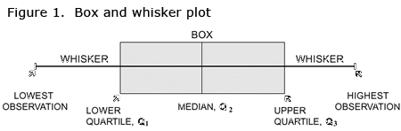
Is anyone aware of a way of generating something like this in Stata which I can then place in/on my chart?
For a working example of a box plot, I've borrowed an example from Nick Cox using tw bar to generate a box plot:
***BEGIN EXAMPLE****
sysuse lifeexp, clear
label var lexp "Life expectancy (years)"
egen median = median(lexp), by(region)
egen upq = pctile(lexp), p(75) by(region)
egen loq = pctile(lexp), p(25) by(region)
egen iqr = iqr(lexp), by(region)
egen upper = max(min(lexp, upq + 1.5 * iqr)), by(region)
egen lower = min(max(lexp, loq - 1.5 * iqr)), by(region)
egen mean = mean(lexp), by(region)
#delim ;
. twoway rbar med upq region, pstyle(p1) blc(gs15) bfc(gs8) barw(0.35) ||
rbar med loq region, pstyle(p1) blc(gs15) bfc(gs8) barw(0.35) ||
rspike upq upper region, pstyle(p1) ||
rspike loq lower region, pstyle(p1) ||
rcap upper upper region, pstyle(p1) msize(*2) ||
rcap lower lower region, pstyle(p1) msize(*2) ||
scatter mean region, ms(Dh) msize(*2) ||
scatter lexp region if !inrange(lexp, lower, upper), ms(Oh) mla(country)
legend(off)
xla(1 `""Europe and" "Central Asia""' 2 "North America" 3 "South America", noticks)
yla(, ang(h)) ytitle(Life expectancy (years)) xtitle("") ;
#delim cr
Thanks
Tim
I'm using Stata 13.1 and generating a series of box plots (209 in total). I understand the workings of a box plot, but my intended audience may not. Therefore I would like to include in my boxplot an example box plot as a legend showing/explaining what each part of the box plot is displaying. Something similiar to this:
Is anyone aware of a way of generating something like this in Stata which I can then place in/on my chart?
For a working example of a box plot, I've borrowed an example from Nick Cox using tw bar to generate a box plot:
***BEGIN EXAMPLE****
sysuse lifeexp, clear
label var lexp "Life expectancy (years)"
egen median = median(lexp), by(region)
egen upq = pctile(lexp), p(75) by(region)
egen loq = pctile(lexp), p(25) by(region)
egen iqr = iqr(lexp), by(region)
egen upper = max(min(lexp, upq + 1.5 * iqr)), by(region)
egen lower = min(max(lexp, loq - 1.5 * iqr)), by(region)
egen mean = mean(lexp), by(region)
#delim ;
. twoway rbar med upq region, pstyle(p1) blc(gs15) bfc(gs8) barw(0.35) ||
rbar med loq region, pstyle(p1) blc(gs15) bfc(gs8) barw(0.35) ||
rspike upq upper region, pstyle(p1) ||
rspike loq lower region, pstyle(p1) ||
rcap upper upper region, pstyle(p1) msize(*2) ||
rcap lower lower region, pstyle(p1) msize(*2) ||
scatter mean region, ms(Dh) msize(*2) ||
scatter lexp region if !inrange(lexp, lower, upper), ms(Oh) mla(country)
legend(off)
xla(1 `""Europe and" "Central Asia""' 2 "North America" 3 "South America", noticks)
yla(, ang(h)) ytitle(Life expectancy (years)) xtitle("") ;
#delim cr
Thanks
Tim
Comment